
Case Study 1
MSU Libraries Homepage
Re-Design
This project is a collaborative redesign of the Michigan State University Library website, the primary resource hub for students and faculty seeking intellectual resources. Given the high traffic on this site, our team focused on enhancing usability to make it as user-friendly as possible. We prioritized key areas with significant user engagement, such as the homepage, search bar (bento box), hours, and events pages, aiming to improve accessibility and navigation for all users.
The Goal
Our goal is to reimagine MSU’s Libraries site so that it is both visually appealing to look and easy and accessible to users.
Research Methods
Personas & Scenarios
This research method was a great opportunity for us to learn the importance of catering to users and their unique experience and needs.
Heuristic Analysis
Heuristic analysis helped us meets user expectations and provides a seamless experience.
Field Study
Field studies provided real-world insights into user behaviors and challenges, ensuring the final design improves usability.
Competitive Analysis
Competitive analysis was crucial in our process as it helped us identify
industry standards, and enhanced
user experience.
Personas & Scenarios
Our team created three fictional scenarios illustrating different ways users might interact with MSU’s Library website. By developing a variety of personas and use cases, we aimed to reflect the diverse needs and goals of actual visitors to the site.


Heuristics
What we did?
For our heuristic evaluation, we examined the MSU Libraries homepage, search box (bento box), library hours, and events sections, assessing each against nine pre-determined heuristics. Each team member provided individual insights, and we then collaborated to discuss our findings. Key takeaways included consistent issues with information organization and visual design, likely resulting from information overload, which can overwhelm users and detract from the page’s usability.

Field Study
What we did?

We collectively observed the way 5 MSU students navigated their way through the library's website by conducting our own individual field studies.
We asked each of our users carry out the following tasks:
1. Search for an article about World War II and find the author’s name.
2. Draft a message to the library for help on a topic.
3. Look for an upcoming event that you would be interested in and find the meeting address/room/building.
4. Find the library’s hours page and check when the library closes on Tuesdays.
Competitive Analysis
What we did?
In this analysis, we compared our client’s site to its competitor's sites. We wanted to focus on direct, indirect, and parallel sites, so we chose East Lansing Library, Library of Congress, and the University of Michigan Library respectively. After looking at the websites of our client's competitors, we found that the MSU library website doesn’t effectively utilize its space and visual hierarchy in organizing the large amounts of information it currently has.

Overall Findings


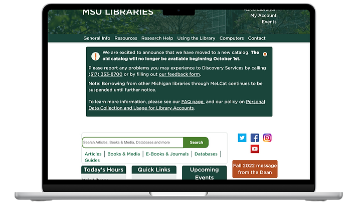
Homepage
The MSU library homepage provides users with broad access to its resources and services, but its outdated design and information-heavy layout can lead to overload and a lack of clear direction. While the structure is somewhat supported by sections like “Today’s Hours,” “Quick Links,” and “Upcoming Events,” key features such as the “Ask a Librarian” link and contact info are relegated to the header or footer, making them easy to overlook. Additionally, the absence of a prominently placed help button further hinders user accessibility and guidance.

Search Results (Bento Box)
The page requires excessive scrolling, with disorganized category layouts making information harder to find. LibChat is poorly placed within a bento box, lacking distinct visual design to differentiate it from other search results.
_edited.jpg)
Hours
The calendar lacks visual hierarchy, appearing as blocks of text that are difficult to interpret, leading to potential cognitive overload. Additionally, the side navigation doesn't highlight selected tabs, adding to user confusion.
_edited.png)
Events Page
The event boxes display a misleading hover effect, suggesting clickability when they are not interactive. The page's outdated aesthetic and overcrowded layout violate minimalist design principles. Additionally, the absence of the standard site navigation/header complicates access to other pages.
Final Deliverables
As we came up with ideas for the site we made sure to elevate the site as much as possible but keep to MSU’s concept. We took color, font and consistency into consideration when redesigning.
_edited_edited.jpg)